web-design-differences

Its a New Year. Is It Time for a Reskin, Refresh, or Redesign?

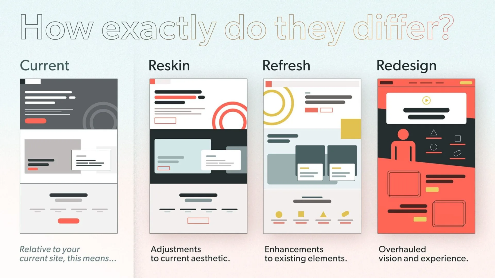
Have you ever looked at your website and thought, “This needs a change, but what kind?” You’re not alone. Many people get confused about terms like reskin, refresh, and redesign. They all sound similar, but they differ in big ways. Based on that graphic you shared, which shows a current site next to these three options, let’s dive in. The graphic asks, “How exactly do they differ?” and breaks it down simply. It compares the current version to reskin (adjustments to aesthetic), refresh (enhancements to elements), and redesign (overhauled vision and experience).

Why does this matter? If you’re running a blog, a shop, or any online space, picking the right update can save time and money. It can also boost how users feel about your site. What if you choose the wrong one? You might end up with a site that looks new but still feels old and clunky. Let’s explore each one step by step. By the end, you’ll have ideas on which might fit your needs. Ready to think about your own site? Let’s start with the basics.

Understanding Your Current Website

Before we jump into changes, let’s talk about the “current” state. The graphic shows it as the starting point: a basic layout with gray tones, simple boxes, and a red button. It’s like your site’s snapshot right now.

Why assess this first? Because any update builds on what you have. Ask yourself:

  • Does your site load fast?
  • Is it easy to navigate?
  • Does it match your brand’s colors and feel?

If you’re happy with the core but want tweaks, you might not need a full overhaul. Suggesting a course of action: Grab a notebook and list what works and what doesn’t. This simple step can guide you. For example, if the layout is solid but colors feel dated, a small change might do the trick.

Now, let’s move to the first option: reskin.

What Is a Reskin?

A reskin is like giving your site a fresh coat of paint. The graphic calls it “adjustments to current aesthetic.” It keeps the same structure but tweaks colors, fonts, or images to make it look modern.

Why choose a reskin? It’s quick and cheap. Perfect if your site works well but looks old. Think of it as updating your wardrobe without buying new clothes—just accessorizing better.

Here are the key features of a reskin, in bullet points for quick reading:

  • Changes visuals only: Swap colors, add new icons, or update fonts.
  • Keeps layout the same: No moving menus or adding pages.
  • Fast turnaround: Often done in days or weeks.
  • Low cost: No need for big coding changes.
  • Minimal disruption: Users won’t feel lost.

For instance, if your site has a dark gray theme like in the graphic, a reskin might switch to brighter reds and circles for a fun vibe. Have you noticed sites that suddenly look sharper without changing much? That’s often a reskin.

To see it in action, check this example of a website before and after a reskin-like update:

panos-website-redesign-Justinmind

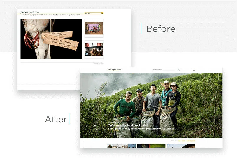
Wondering if this is for you? If your traffic is good but bounce rates are high due to outdated looks, try a reskin. Suggestion: Use free tools like Canva to mock up color changes and see how it feels.

What Is a Refresh?

Moving up a level, a refresh is about “enhancements to existing elements,” as the graphic says. It’s more than just looks—it’s improving what’s there without starting over.

What’s the appeal? A refresh fixes pain points while keeping the familiar feel. It’s like reorganizing your room: same furniture, but better arranged.

Key aspects in bullets:

  • Builds on current setup: Add features like better search bars or mobile tweaks.
  • Improves user experience: Make buttons bigger or add animations.
  • Moderate effort: Takes weeks to months.
  • Balances cost and impact: More than reskin, less than redesign.
  • Keeps core identity: Your brand stays recognizable.

In the graphic, the refresh version adds yellow circles and cleaner lines to the gray base. It’s enhanced but still similar. Ever visited a site that added a chat feature or better images? That’s a refresh.

Here’s a visual example of a website before and after a refresh:

web design refresh

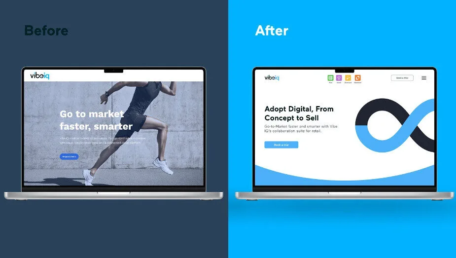
Are you dealing with user complaints about slow features? A refresh could help. Action idea: Survey your visitors with a quick poll—what one thing would they improve? Use that to plan your enhancements.

What Is a Redesign?

Now, for the big one: redesign. The graphic labels it as an “overhauled vision and experience.” This is a total makeover, rethinking everything from layout to purpose.

Why go this route? If your site no longer fits your goals, like if your business has grown, a redesign aligns it anew. It’s like building a new house instead of patching the old one.

Bullets for the main points:

  • Complete overhaul: New structure, navigation, and features.
  • Focuses on vision: Matches current trends and user needs.
  • High effort: Months to plan and build.
  • Bigger budget: Involves designers and developers.
  • Fresh start: Can boost engagement a lot.

The graphic shows a bold red background with new icons and a video play button—totally different from the current gray. Sites like major brands do this every few years to stay relevant.

Take a look at this before-and-after redesign example:

website redesign

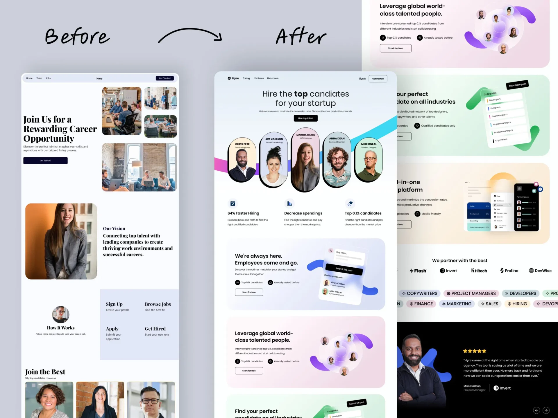
Is your site from five years ago and not mobile-friendly? Time for a redesign.

Suggestion: Hire a pro like us Kajabi-Experts. Start small by sketching your dream layout.

How Do They Compare Side by Side?

To make it clear, let’s compare them. The graphic puts them next to each other for a reason—it shows the progression from minor to major changes.

Use this table for a quick overview:

Aspect Reskin Refresh Redesign
Scope Visual tweaks Element improvements Full overhaul
Time Short Medium Long
Cost Low Moderate High
Risk Low Medium High
Impact Subtle Noticeable Transformative

What stands out to you here? If time is tight, reskin wins. But for big growth, redesign might be worth it.

Pros and cons in bullets for each:

Reskin Pros:

  • Quick to implement.
  • Keeps users comfortable.

Reskin Cons:

  • Doesn’t fix deep issues.
  • Might need more later.

Refresh Pros:

  • Improves without chaos.
  • Good value for effort.

Refresh Cons:

  • May not solve all problems.
  • Could feel patchwork.

Redesign Pros:

  • Modernizes everything.
  • Boosts long-term success.

Redesign Cons:

  • Expensive and time-consuming.
  • Risk of alienating users.

Have you weighed these for your site? Think about your goals—what’s your timeline and budget?

When to Choose Each One

Choosing depends on your situation. Ask: What’s wrong with my site? Is it just looks, or deeper?

  • Pick reskin if: Your site functions well but looks tired. Great for small businesses on a budget.
  • Go for refresh when: Users like the site but want better features. Ideal for growing sites.
  • Opt for redesign if: Your brand has evolved, or the site is outdated tech-wise. Best for major shifts.

Real-world examples: A blog might reskin for a new season’s colors. An e-commerce site could refresh with better carts. A company rebranding? Full redesign.

Suggestion: Audit your site using free tools like Google PageSpeed. See what scores low and match it to these options.

Final Thoughts: What’s Next for Your Site?

We’ve covered how reskin, refresh, and redesign differ, straight from that graphic. Reskin adjusts aesthetics, refresh enhances elements, and redesign overhauls the vision. Each has its place.

But what about you? Are you ready to update? Start by evaluating your current site. Maybe try a small reskin first to test waters. Or, if you’re bold, plan a redesign. What changes excite you most? Share your thoughts—perhaps we can brainstorm more ideas. Remember, the right choice keeps your site fresh and users happy. Let’s make your online space shine!

Have a website thats not on Kajabi but still needs some design work? Visit our sister company SITE ORBIT. They specialize in platforms like WordPress, Squarespace, Wix, LearnDash, Showit and more

Ready to launch a site that sells while you’re off the clock?

Every day you wait is a day your site isn’t selling, your funnel isn’t converting, and your content isn’t reaching the right people.

If you’re stuck, delayed, or just not seeing the results you expected - let’s fix that now. We’ve helped over 150+ business owners move faster, launch smarter, and make Kajabi work like it should.

Book your free Zoom call now

We’ll review where you are, where you want to go, and how to get there - super fast.

Get A Free Strategy Call Today
mobile-web-design
Pareto-Principle

The Rule That Changed Everything for Me

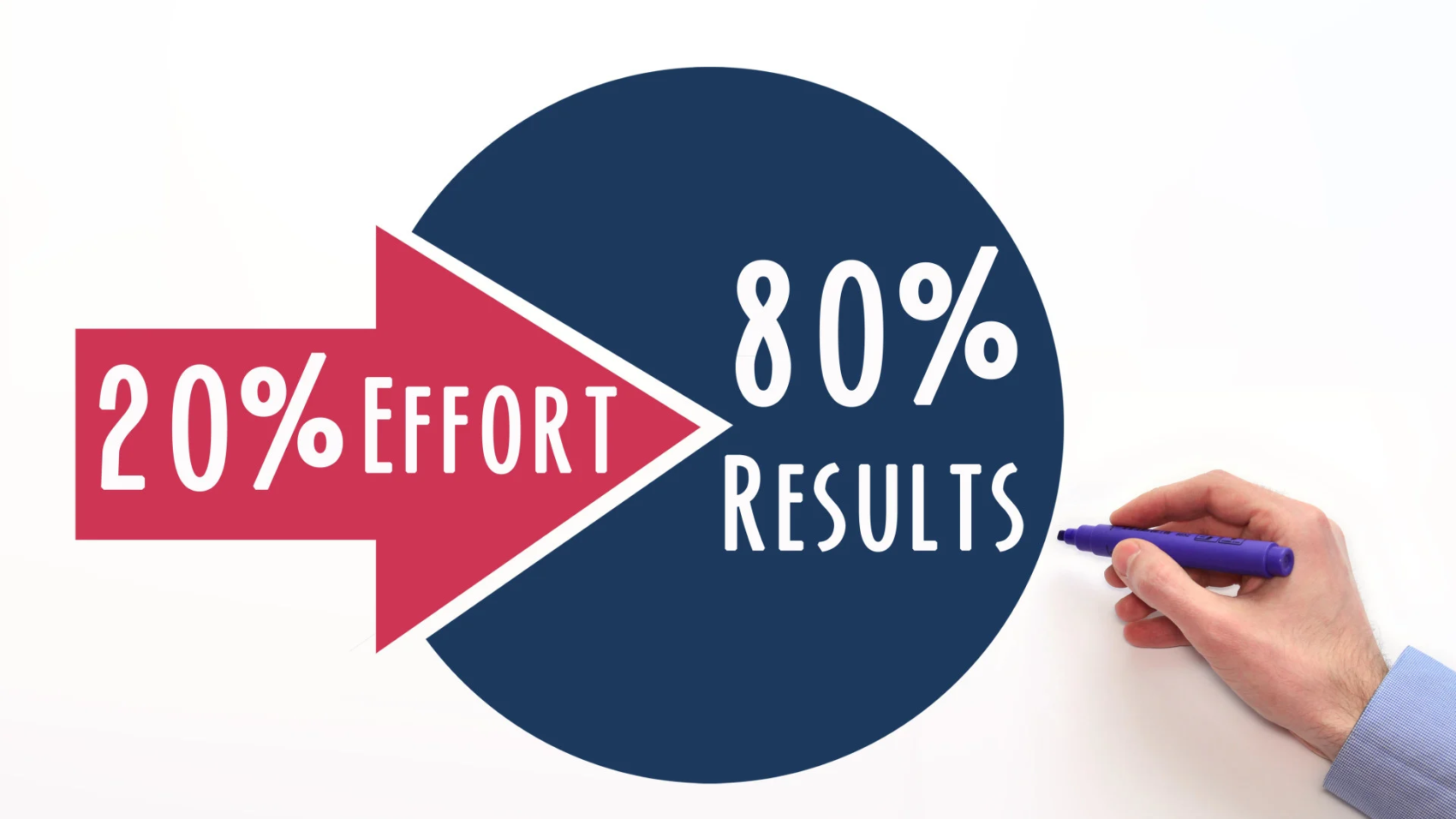
Use the 80/20 rule to grow your course business with less effort and more clarity. Focus on the few actions that bring most of your enrollments, student results, and revenue. Improve your strongest program first, serve your most engaged buyers, and spend your best hours on content and tasks that drive conversions. Automate support and admin work, track simple metrics each week, and create resources that answer repeat questions. This approach helps you build a predictable and profitable e-learning business without long hours or constant new projects.

desktop design is king

The AI Search Revolution: Why Desktop is King Again

Make Sure Your Website is Future-Proof

Remember when “mobile-first” was the mantra of every web developer, marketer, and business owner? For years, the industry has been laser-focused on optimizing for mobile users – streamlined designs, bite-sized content, and lightning-fast load times for smaller screens. But a seismic shift is underway, and it’s turning everything we thought we knew about user behavior upside down.

The rise of AI-powered search is bringing desktop back to the forefront, and businesses that fail to adapt risk being left behind.

The Data Speaks: Desktop Dominates AI Search

A staggering statistic from BrightEdge reveals that 94% of ChatGPT referrals come from desktop users. This isn’t an isolated trend; other AI search platforms like Perplexity, Bing, and Gemini report similar numbers, with over 90% of their traffic originating from desktops. This data challenges the mobile-first paradigm that has dominated digital strategy for over a decade.

Why does this matter? Because AI search is fundamentally changing how users interact with the internet. Unlike traditional search engines, where mobile users often dominate due to convenience and accessibility, AI-driven search is a different beast. It’s not about quick queries on the go; it’s about deep, intentional research. And that’s happening on desktops.

Mobile vs. Desktop: A Tale of Two Mindsets

Think about your own behavior. When you’re casually browsing or looking for a quick answer – say, the weather or a restaurant’s hours – you likely reach for your phone. Mobile users are often in a hurry, seeking instant gratification. They ask, get an answer, and stay within the app or move on. This aligns with the mobile-first philosophy: optimize for speed, simplicity, and snackable content.

Now, contrast that with how you use a desktop. When you sit down at your computer, you’re in a different mindset. You’re researching a product, diving into a complex topic, or comparing options. You’re clicking through links, reading long-form articles, and engaging deeply with content. Desktop users aren’t just scrolling – they’re analyzing, learning, and converting.

This distinction is critical. AI search tools like ChatGPT and Perplexity cater to users who are seeking detailed, nuanced answers. These users aren’t swiping through a feed; they’re sitting at their desks, ready to dig in. And that’s why desktop referrals are dominating.

The Fall of Mobile-First and the Rise of Desktop-First

For years, mobile-first design was non-negotiable. Google’s algorithm prioritized mobile-friendly sites, and businesses scrambled to optimize for smaller screens. Responsive design, simplified navigation, and concise content became the gold standard. But AI search is rewriting the rules.

If 94% of ChatGPT’s referrals come from desktop, businesses that have poured all their resources into mobile optimization may be missing the mark. A site that’s sleek and fast on mobile but lacks depth or functionality on desktop could be invisible to AI-driven traffic. This is a wake-up call: the desktop experience matters again, and it matters more than ever.

What This Means for Your Digital Strategy

So, how should businesses adapt to this desktop-first resurgence? Here are the key implications:

1. Reevaluate Your UX Priorities

If you’ve been hyper-focused on mobile UX, it’s time to shift gears. Desktop users expect a robust, feature-rich experience. This means rethinking navigation, layout, and functionality to cater to users who are sitting down for a focused session. Ensure your desktop site is intuitive, visually appealing, and easy to navigate. Don’t sacrifice depth for simplicity; desktop users are here for the details.

2. Invest in Long-Form Content

AI search thrives on depth. Unlike mobile users who skim short posts, desktop users are more likely to engage with comprehensive, well-researched content. Long-form articles, detailed guides, and in-depth comparisons are your best bet for capturing AI-driven traffic. Don’t be afraid to go deep – desktop users are ready to read.

3. Optimize for Conversion

Desktop users aren’t just browsing – they’re converting. Whether it’s signing up for a newsletter, making a purchase, or filling out a form, desktop users are more likely to take action. Make sure your calls-to-action (CTAs) are prominent and your conversion funnels are seamless on desktop. A clunky desktop experience could cost you valuable leads.

4. Balance Mobile and Desktop

This isn’t to say mobile optimization is irrelevant. Mobile still accounts for a significant portion of overall web traffic, and Google’s algorithms haven’t gone away. The key is balance. Your site needs to perform well on both mobile and desktop, but the desktop experience should no longer take a backseat.

The Bigger Picture: AI is Redefining Search

The shift to desktop-first isn’t just about user behavior; it’s about how AI search engines function. Traditional search engines like Google rely on crawling websites and ranking them based on a variety of factors, including mobile-friendliness. AI search tools, on the other hand, prioritize delivering precise, contextually relevant answers. They don’t just point users to websites; they synthesize information and present it directly.

This means that businesses need to optimize not just for visibility but for relevance. AI tools are more likely to recommend content that is authoritative, detailed, and well-structured. A shallow, mobile-optimized page might rank well on Google, but it’s less likely to be surfaced by ChatGPT or Perplexity. Desktop-friendly, content-rich pages are better positioned to win in this new landscape.

How to Thrive in a Desktop-First World

To stay ahead, businesses need to adapt their strategies to align with the rise of AI-driven, desktop-first search. Here are actionable steps to get started:

  • Audit Your Desktop Experience: Test your site on multiple desktop browsers and screen sizes. Is it easy to navigate? Are key features accessible? Does it load quickly and display correctly?
  • Create In-Depth Content: Invest in long-form blog posts, whitepapers, and case studies that answer complex questions. Use clear headings, bullet points, and visuals to make content scannable yet detailed.
  • Leverage Analytics: Use tools like Google Analytics or BrightEdge to track where your traffic is coming from. If you’re seeing a spike in desktop referrals from AI tools, double down on optimizing for those users.
  • Test AI Search Queries: Experiment with how your content appears in AI search results. Ask questions on ChatGPT or Perplexity that relate to your industry and see which sites come up. Use this to inform your content strategy.
  • Prioritize User Intent: Understand what desktop users are looking for; depth, clarity, and actionable insights. Tailor your content to meet those needs.

The Future of Search is Here

The mobile-first era was driven by the rise of smartphones and Google’s dominance. But as AI search tools like ChatGPT, Perplexity, and Gemini gain traction, we’re entering a new phase: the desktop-first era. This shift doesn’t negate the importance of mobile but highlights the need for a balanced approach that prioritizes depth and engagement on desktop.

Businesses that adapt to this change will have a competitive edge. By focusing on robust desktop experiences, in-depth content, and conversion-optimized design, you can position your brand to thrive in the AI-driven search landscape. The data is clear: desktop is back, and it’s time to embrace it.

Ready to launch a sales page that sells while you’re off the clock?

Every day you wait is a day your site isn’t selling, your funnel isn’t converting, and your content isn’t reaching the right people.

If you’re stuck, delayed, or just not seeing the results you expected - let’s fix that now. We’ve helped over 150+ business owners move faster, launch smarter, and make Kajabi work like it should.

Book your free Zoom call now

We’ll review where you are, where you want to go, and how to get there - super fast.

Get A Free Strategy Call Today
mobile-web-design
4-sales-page-musts-to-convert

4 Sales Page Must-Haves That Actually Convert

Your sales page should be your best salesperson. But Is it?

Your sales page isn’t a brochure – it’s your hardest-working salesperson. Use these four non-negotiables to connect with your ideal client, crush hesitation, and drive more “Buy Now” clicks.

1) Copy that speaks to pain and desire

Hook readers fast with language they already use to describe their problem and their dream outcome. Then shift from features to tangible results: show how life looks after they say “yes.”

2) Visuals that make digital offers feel real

You can’t photograph an online course on a shelf—but you can make it tangible. Use mockups: your eBook on a tablet, templates on a laptop, videos on a phone. Visibility = perceived value.

3) Social proof that builds instant trust

Back up your claims with validation from others. Mix formats to increase credibility:

  • Short video testimonials or Loom reviews
  • Client success stories (problem → solution → result)
  • Screenshot raves from comments/DMs

New offer? Borrow proof from related services or pre-release your product to a few ideal clients in exchange for a testimonial.

4) Reassurance that removes risk

Hesitation kills conversions. Add a clear guarantee (i.e., “7-day refund, no questions asked”) to lower risk and signal confidence in your results.

Other high-impact elements to include

  • Scroll-stopping headlines and a clear subhead
  • Product features + concise descriptions
  • “Is this for me?” fit checklist
  • Value stack / price comparison
  • FAQs that neutralize common objections
  • Multiple CTA buttons (“Buy Now”) and anchor links
  • Creator bio for credibility and connection

I build Kajabi sales pages that speak to your buyers and convert. Let’s map yours together.

Ready to launch a sales page that sells while you’re off the clock?

Every day you wait is a day your site isn’t selling, your funnel isn’t converting, and your content isn’t reaching the right people.

If you’re stuck, delayed, or just not seeing the results you expected - let’s fix that now. We’ve helped over 150+ business owners move faster, launch smarter, and make Kajabi work like it should.

Book your free Zoom call now

We’ll review where you are, where you want to go, and how to get there - super fast.

Get A Free Strategy Call Today
mobile-web-design
WeLoveOurClients

How to Win Deals and Keep Clients Hooked: Romance Your Client


Imagine this: you’ve just landed a client you’ve been chasing for months. They’re excited. You’re excited. The first few weeks go great. Then… radio silence. Emails get shorter. Response times get longer. Eventually, the next project goes to someone else.

It’s not because you weren’t good at your job. It’s because you didn’t romance the client.

Romance in business isn’t about flowers and chocolates; it’s about building a relationship so strong they can’t imagine working with anyone else.

Here’s how to make that happen.


1. Keep the Conversation Alive

Great client relationships aren’t built on one-way updates; they’re built on engagement. You’ve got to talk to them, not at them.

Ask questions that invite them in:

“What do you think, Don?”

Simple, direct, and impossible to ignore. When clients feel part of the process, they’re invested in the outcome.


2. Make Your Value Impossible to Miss

Here’s the truth: your client is busy. They’re juggling a hundred things, and they won’t always notice your wins. That’s your job.

Don’t just say, “We’ve been making progress.” Instead, bullet it out:

  • Launched the new landing page ahead of schedule
  • Updated the email automation to match the new offer
  • Reduced checkout steps from 5 to 3, improving conversions

Now they see the value you’ve created – and they remember it.


3. Surprise Them with More Than They Expect

The easiest way to stand out? Do something they didn’t ask for.

Maybe you noticed a page load issue and fixed it. Maybe you sent them an industry insight they’d never seen. These small surprises build trust – and trust builds loyalty.


4. Show You’re More Than a Task-Doer

Anyone can follow a to-do list. The best clients want thinkers – people who bring fresh ideas to the table.

Even if they don’t say yes to every idea, they’ll remember you’re hustling for them. That hustle keeps you top of mind when the next big project comes around.


5. Act Like You’re Always Auditioning

Every meeting. Every email. Every call. It’s all an audition for the next project.

They might not buy every offer, but they will notice if you’re consistently energetic, proactive, and two steps ahead. The person who shows up like that? They get called back.


6. Lead the Dance

Don’t just sit there waiting for direction – move things forward.

Your clients are busy. If you make their life easier by anticipating the next step, you instantly become indispensable.


7. Speak in “We” Instead of “I”

Language matters. Saying “we” creates a subtle but powerful shift, it makes it feel like you’re already on the same team.

Instead of: “I’ll work on that for you.”

Say: “We’ll get that handled.”

That one little word makes the deal feel half-closed already.


8. Be Audacious – With a Straight Face

If anyone can do it, it’s you and your team and your client should know it.

Even if they suspect you’re a bit overconfident, they’ll be impressed by your conviction. Clients don’t want timid. They want partners who will take the hill with confidence.

So make the big claim. Keep a straight face. Let them believe you’re just crazy enough to pull it off (even if you’re crossing your fingers behind your back).


9. Sometimes… Just Pick Up the Phone

Yes, we live in the age of Zoom and Slack. But sometimes, the best move is to PUP your client. Pick Up the Phone.

It’s personal. It’s quick. It cuts through confusion in minutes. And it reminds them there’s a real person on the other side who’s invested in their success.


Bottom line:
Romancing your client isn’t about overpromising – it’s about showing up with energy, ideas, and a little bit of boldness. The more you treat the relationship like an ongoing courtship, the less you’ll worry about competitors knocking at their door.

Because once a client feels valued, engaged, and confident in your ability; they’re yours for the long haul.

Ready to Launch Smarter
with Kajabi?

Every day you wait is a day your site isn’t selling, your funnel isn’t converting, and your content isn’t reaching the right people.

If you’re stuck, delayed, or just not seeing the results you expected - let’s fix that now. We’ve helped over 150+ business owners move faster, launch smarter, and make Kajabi work like it should.

Book your free Zoom call now

We’ll review where you are, where you want to go, and how to get there - super fast.

Get A Free Strategy Call Today
mobile-web-design